
LiveRamp powers great experiences by making it safe and easy to connect the world’s data, people, and applications. We are the industry pace-setter and one of the fastest-growing SaaS businesses.
As a Visual Designer at LiveRamp, I work closely with Design Directors to elevate LiveRamp’s visual identity across a variety of mediums, devices, and platforms.
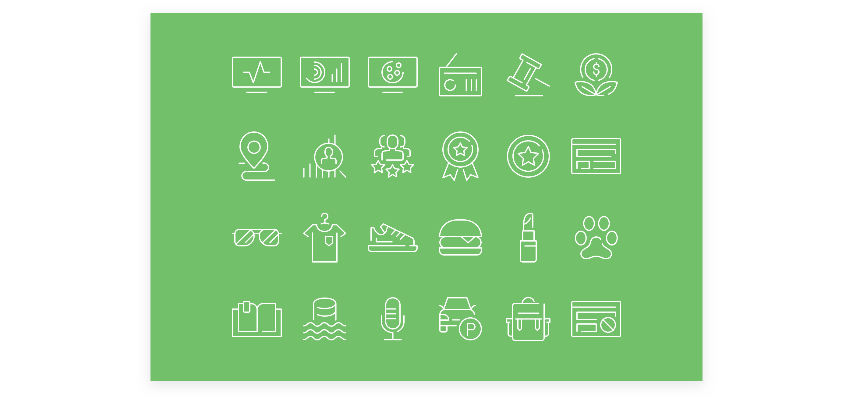
My main responsibility is to design marketing collateral such as ads, blog graphics, marketing emails, newsletters,one pagers, and social media assets consistent with the brand guidelines. I also create, redesign, and revise brand assets such as icons and illustrations.
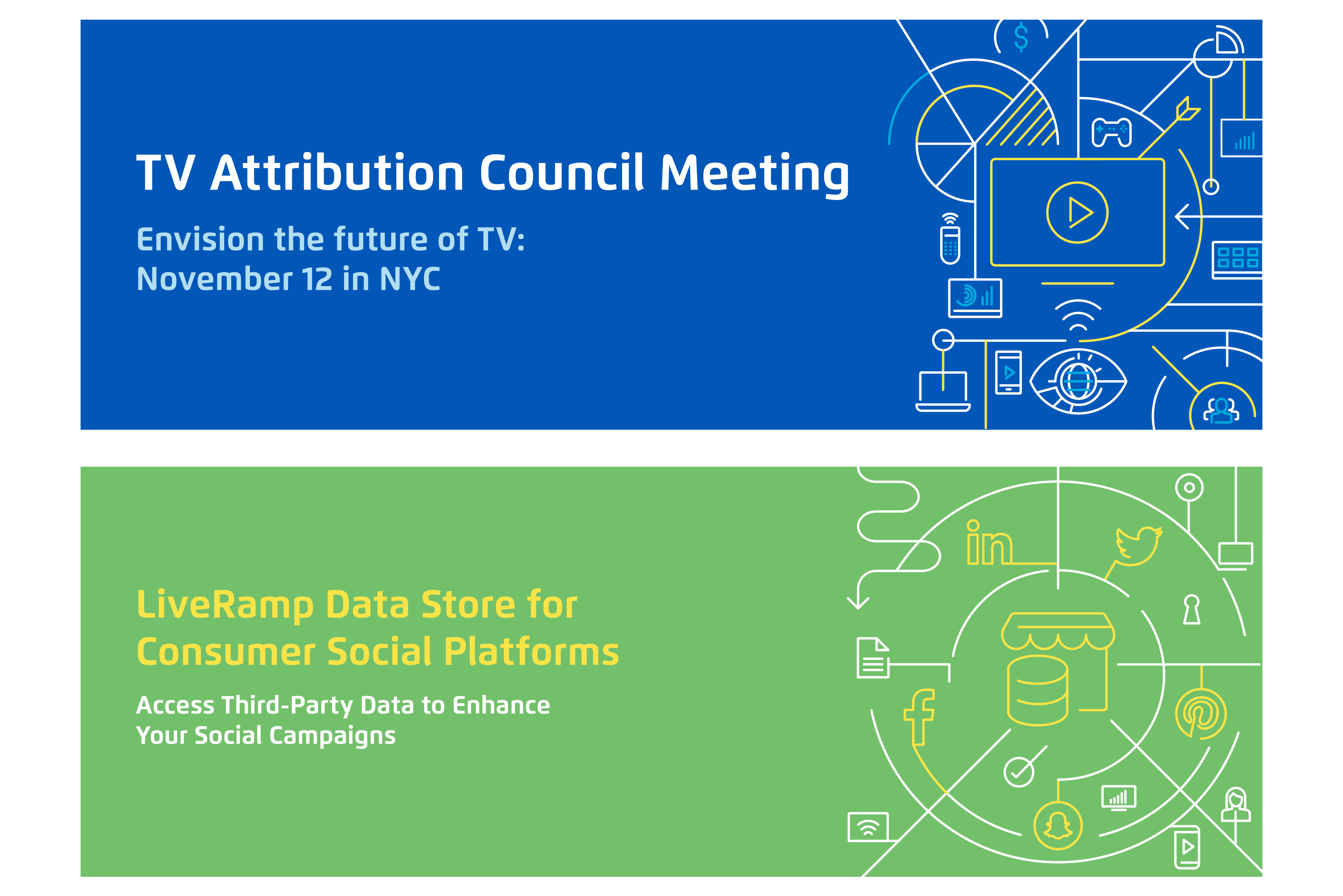
The following are two illustraion that I designed for the headers of LiveRamp Landing Pages. Each graphic was designed to support the purpose and call to action of the page, with a color palette and illustration that directly support the header copy. Each illustration was designed to visually connect the components of the new product and the event being promoted on the landing page.
Illustration is a core part of LiveRamp visual language, providing a vehicle for visual storytelling beyond conventional imagery and stock photography. The illustrations are comprised of icons and vector lines to communicate concepts, giving a unique style to the LiveRamp brand. These two the structured style, it presents a journey or a story of our product.
In the "TV Attribution Council Meeting" graphic, I applied different structures and layouts to connect the icons through lines and graphics. I chose an on-brand color palatte with higher contrast to try to immediately draw a visitor's attention. I also utilized grids in order to create a clean order and pleasant balance.
In the "LiveRamp Data Store for Consumer Social Platforms" graphic, the hosting page is a call to action to drive visitors to sign up for the datastore product to enhance social marketing campaigns with third-party data. To reinforce this focus, I positioned the datastore icon in the center, with each social media platform surrounding the datastore, followed by each consumer platform such as phone, mobile, and desktop. Once again, maintaining balance was a focus in the design.

